BRAND IDENTITY PACKAGING PRINT LOGO SOCIAL MEDIA MERCHANDISE
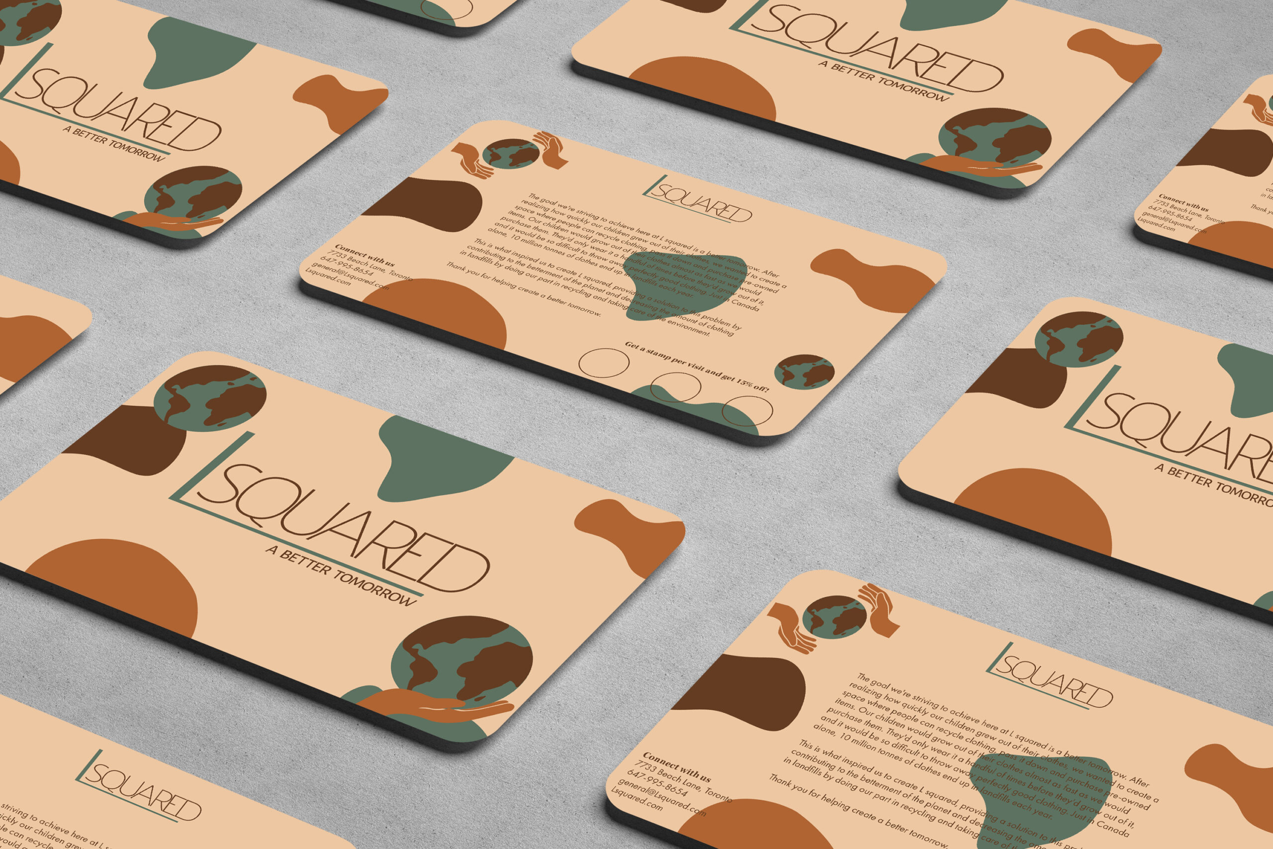
L Squared
Background
Gently-used clothing store for children between ages 0-8 years old. Owned by 2 sisters, Bada and Hae Lee. Both sisters have families with young children and realized how quickly their kids grow out of their clothes before they get worn out. They started this store in an effort to reduce the amount of material waste on earth, by reselling good quality used clothing. Instead of the clothes ending up in landfills before it’s even worn out, it’s rehomed. By doing this they’re helping people to be more environmentally friendly/conscious while purchasing clothing and giving them an alternative to buying new clothes for their children which they grow out of and quickly become trash.
This project was created as a part of a corporate design class.
Problem
The client is opening a new retail clothing store and requires an effective brand identity to create a successful business for themselves. The brand must have a purpose and reason for them to exist, a good understanding of their audience and who they want to target, and what group would be their ideal customers. They need to stand out from their competitors, communicate their goals/vision effectively and have a persona that resonates with their target audience.
Tools
Adobe Illustrator, Adobe Photoshop, Procreate
Solution & Process
1. Research
I conducted in-depth research and analysis, exploring various aspects, including the category of business and products, the client’s goals and beliefs, unique differentiators from competitors, and potential brand name inspiration from the owner’s name. I also created a detailed target group profile, describing their age, employment, income, habitat, hobbies, music preferences, personal style, and clothing needs and wants, along with four adjectives summarizing their personality and taste. I also researched two competitors, analyzing their brand personalities, graphic styles, brand marks, icons, patterns, colours, and typography to identify strengths and areas for improvement. Lastly, I presented three graphic design style references with significant characteristics and explanations for why they’d be appropriate for the brand.
2. Strategy
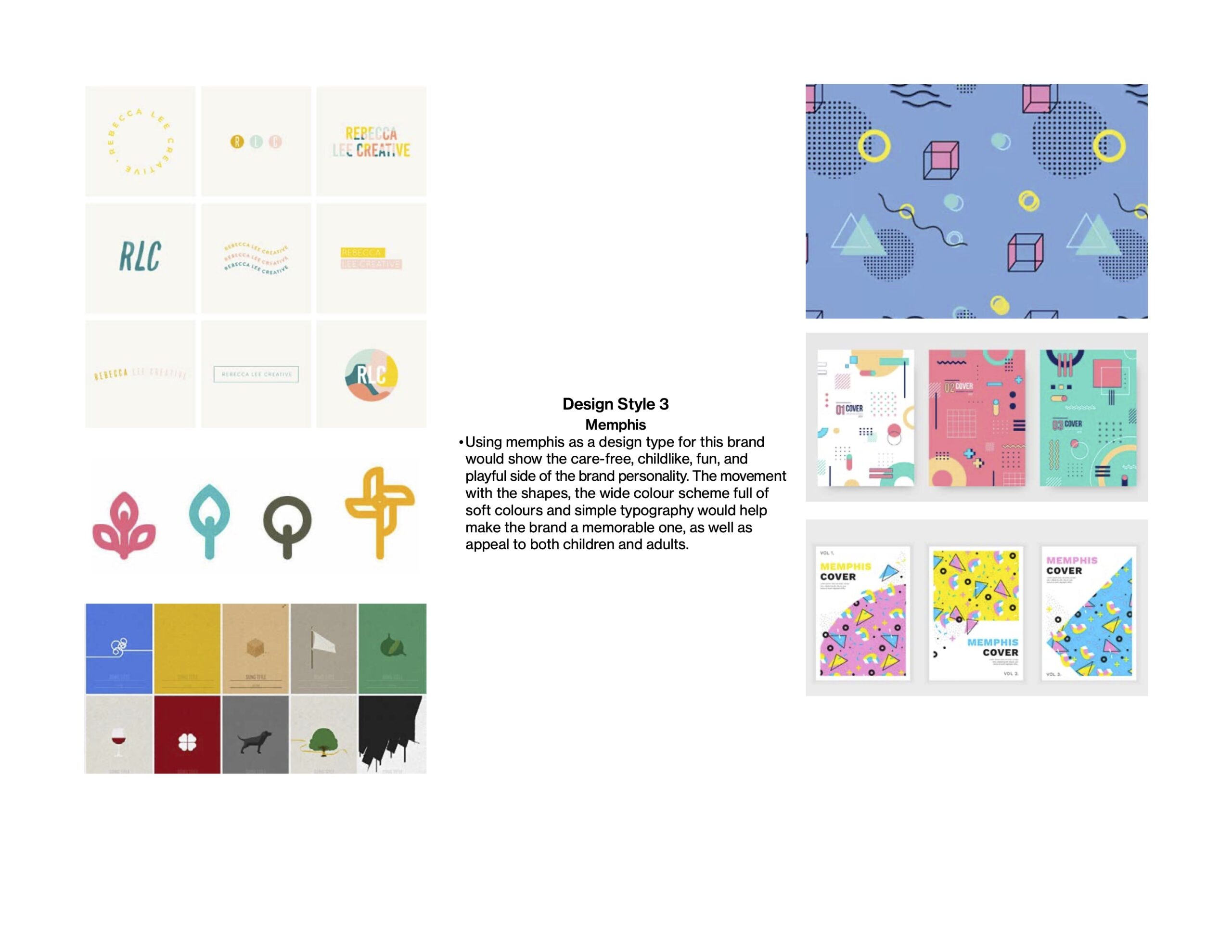
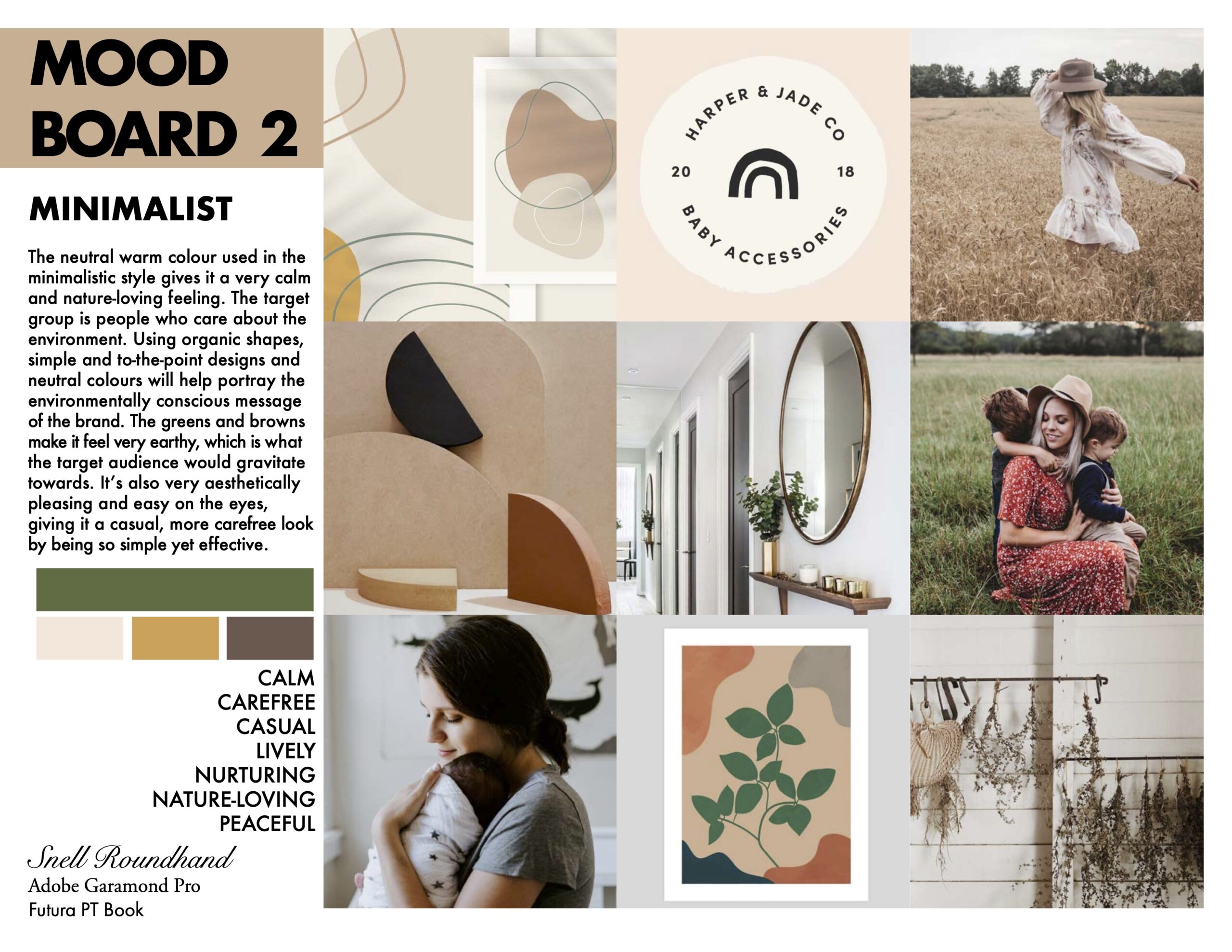
I created three distinct Mood Boards, showcasing different design styles, colour palettes, typography, target group images, attributes, and imagery. I described a chosen graphic design style reference. I explained how the unique characteristics of this style would effectively reflect the brand’s expression and strongly connect with the target audience. To capture the essence of the brand, I listed at least five attributes that could best describe its personality. I utilized images that demonstrated the chosen design style reference, showcased the colour palette, depicted the target group, and incorporated imagery that resonated with the brand’s desired tone.
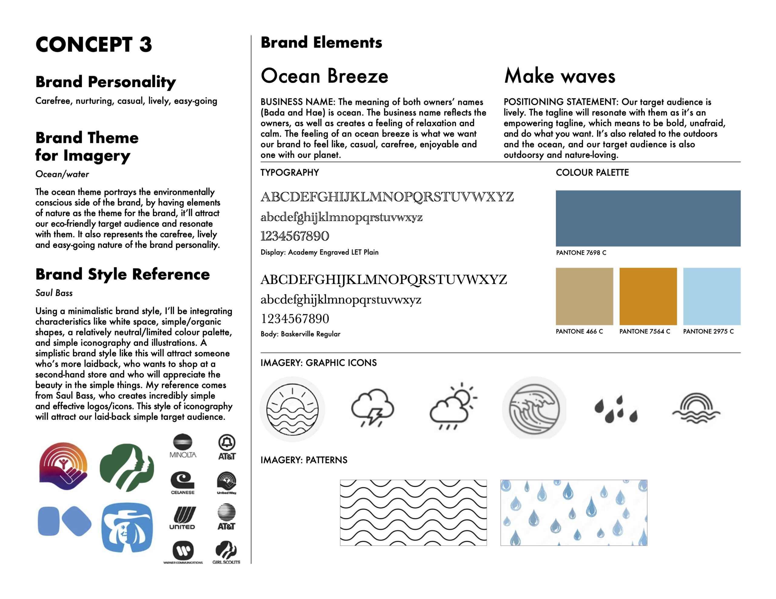
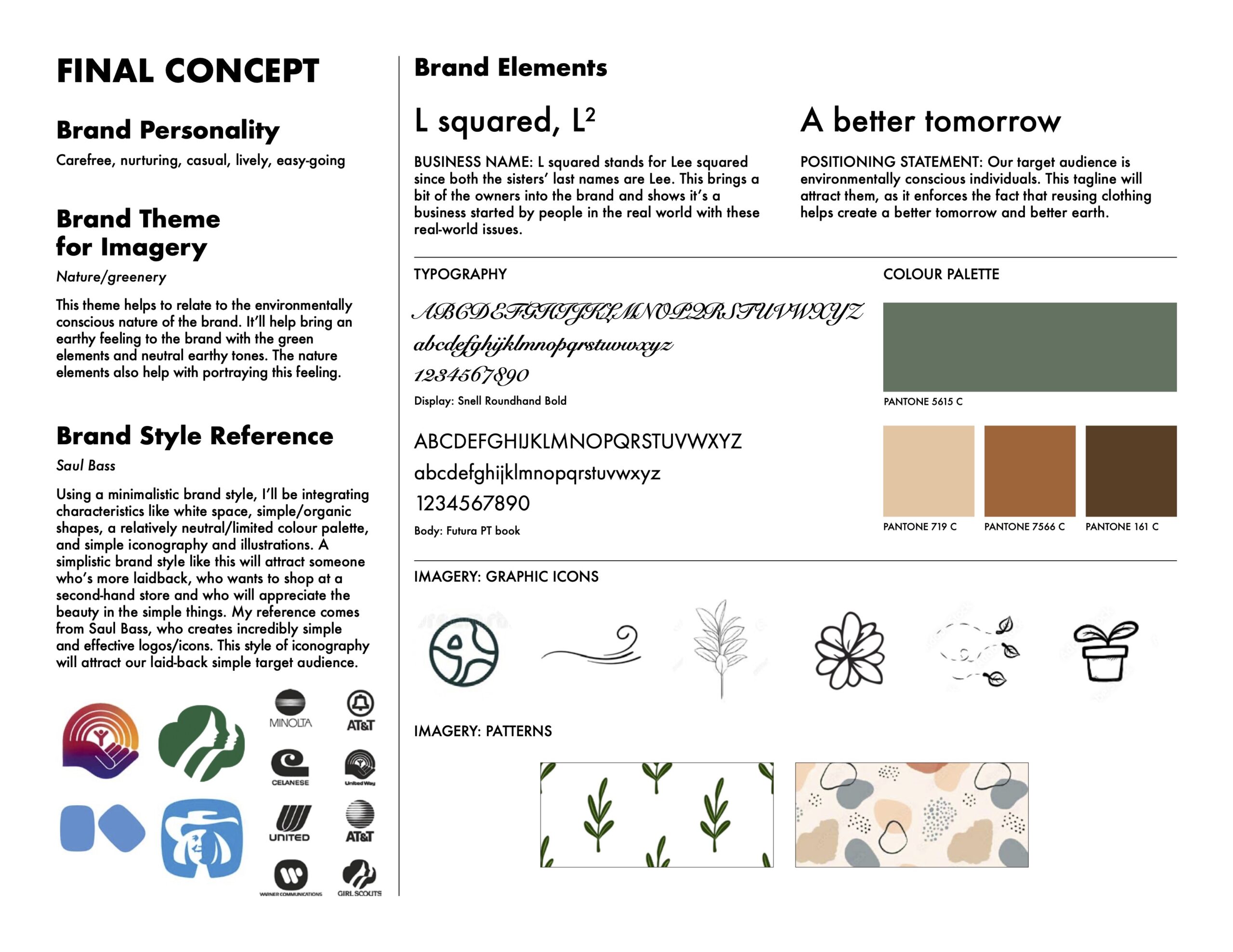
3. Concepts
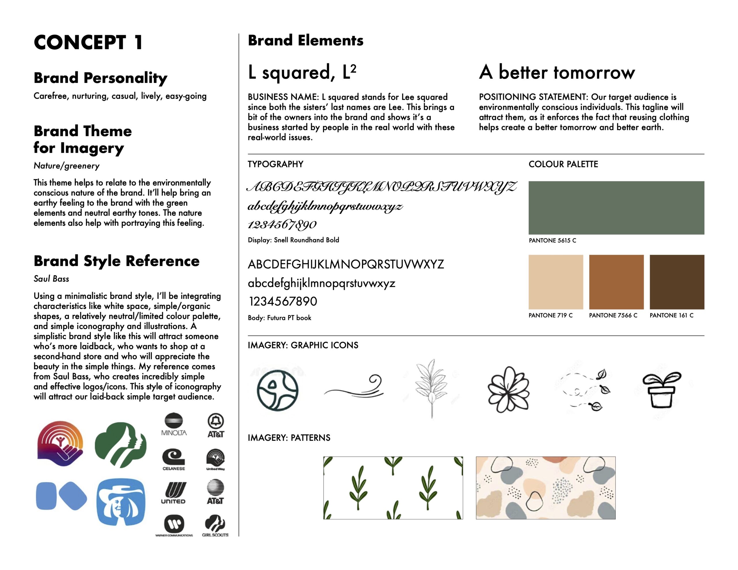
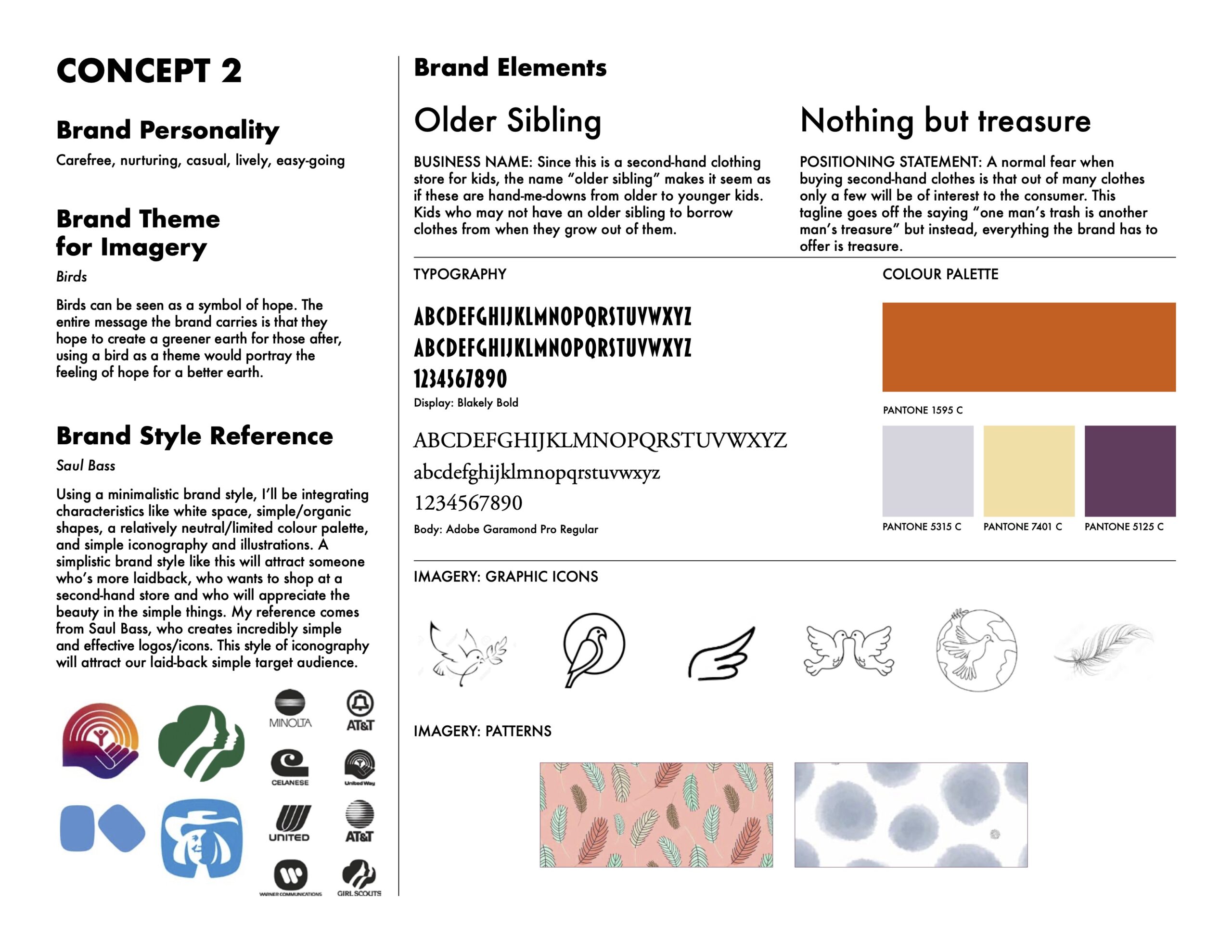
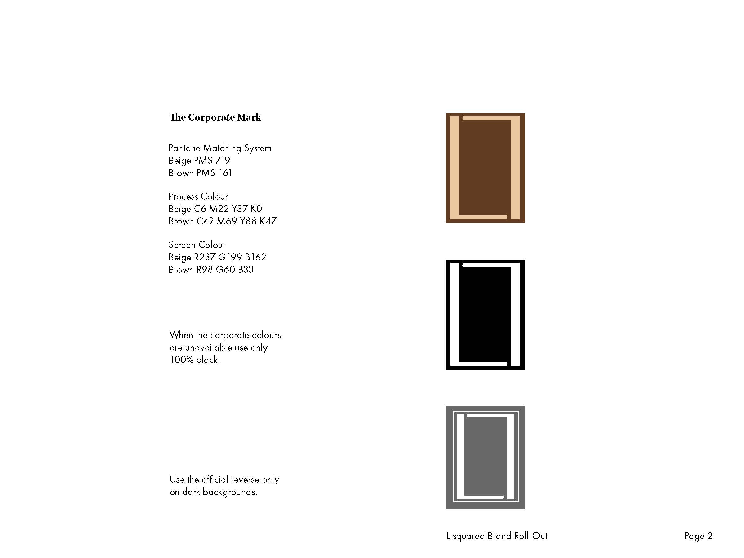
I created 3 concepts presenting both the written and visual aspects of the solution. I described the brand personality attributes using three carefully chosen words and introduced a brand theme that conveyed a compelling visual idea for the brand imagery, explaining its appeal to the target audience. To align with the chosen strategy, I incorporated a style reference that further connected with the target group. The visual representation included a suggested brand name and positioning statement, each with brief rationales. The colour palette featured one dominant colour and three harmonious colours specified with Pantone Solid Coated numbers. I also included two typefaces, one for display and one for body copy. For the imagery, I included six brand icons in vector format and two vector patterns, using referenced images to demonstrate my intended plan.
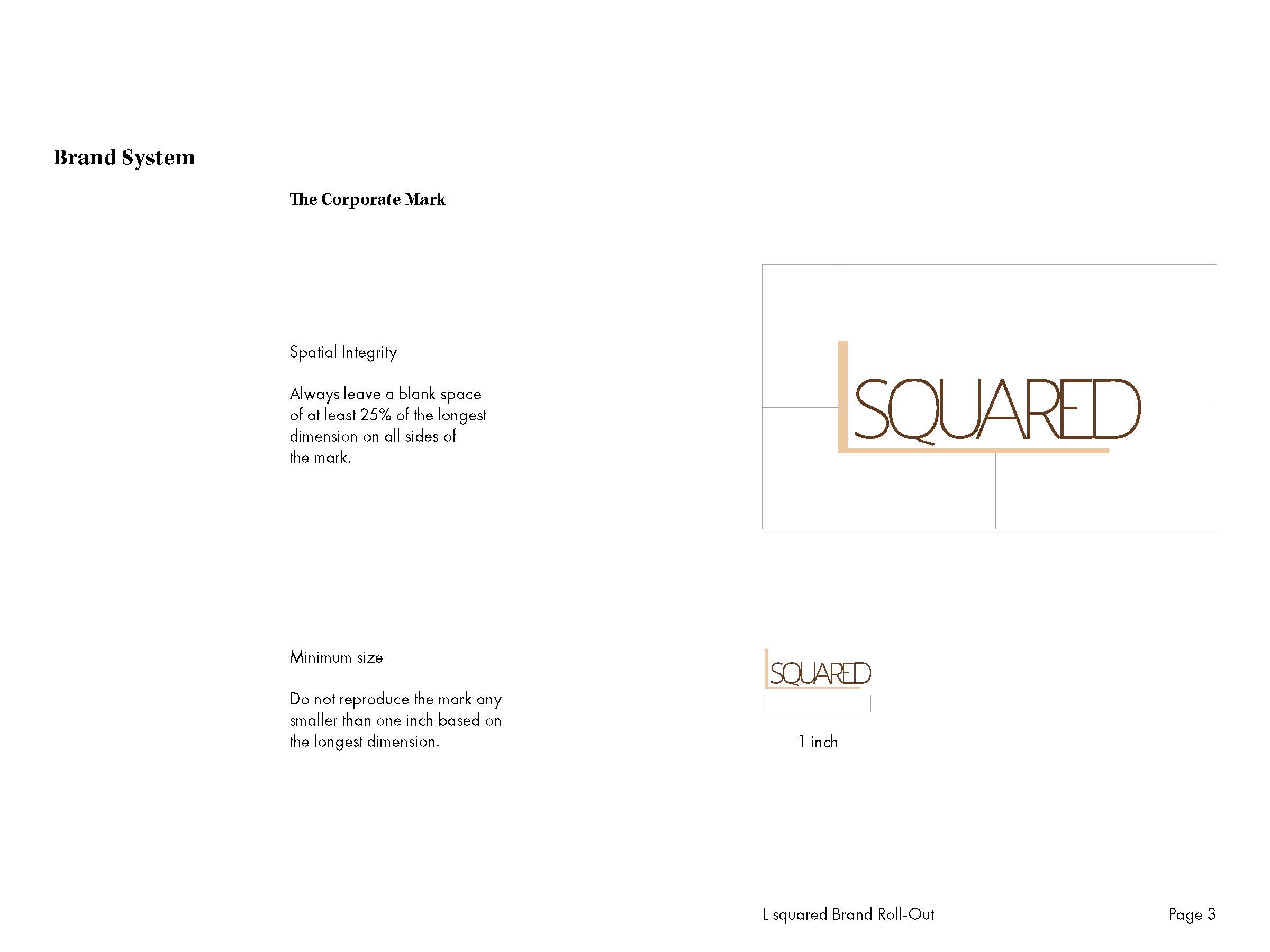
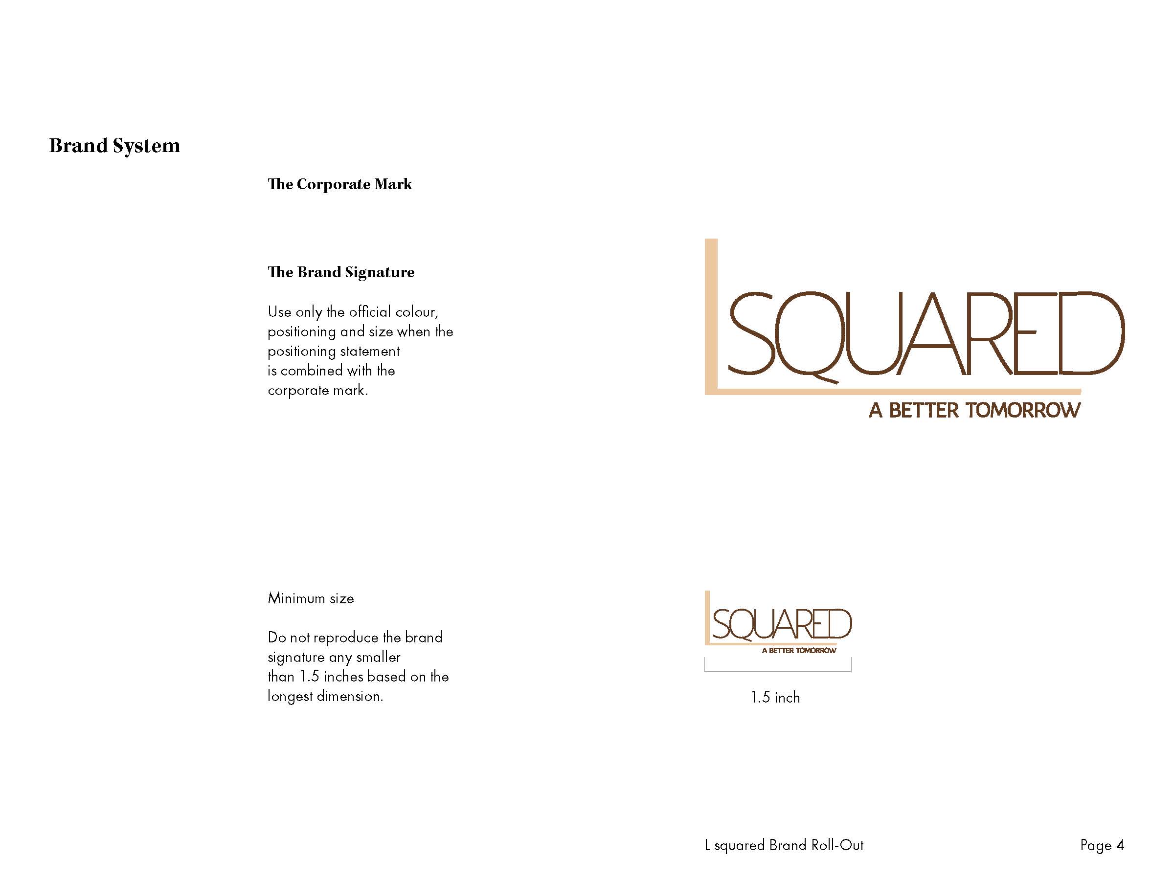
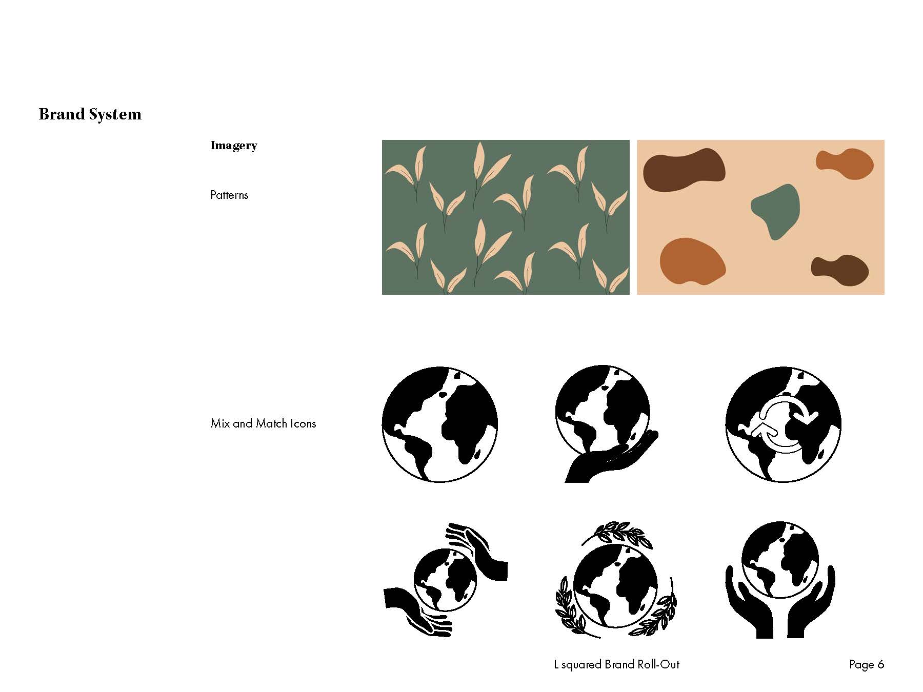
4. Brand System
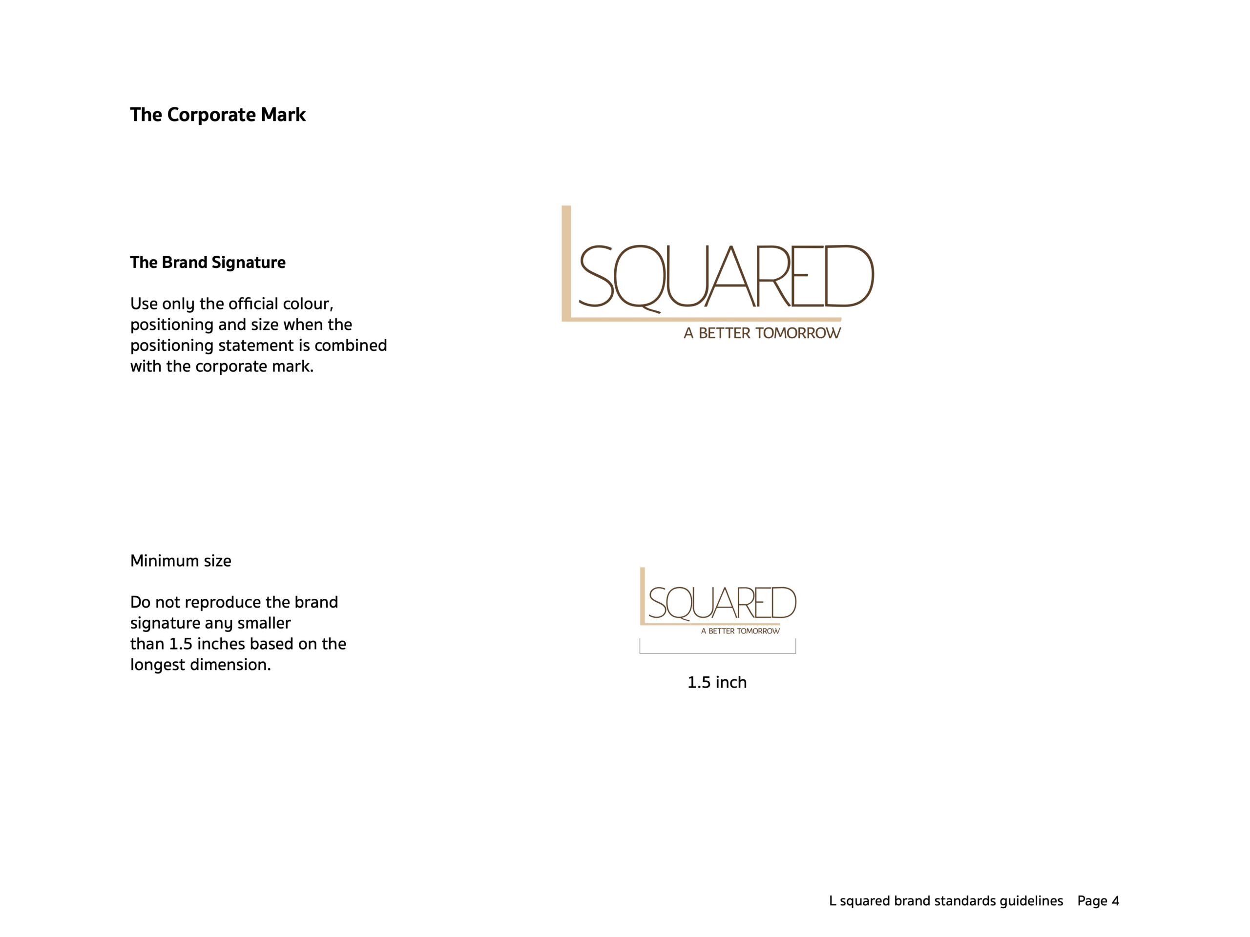
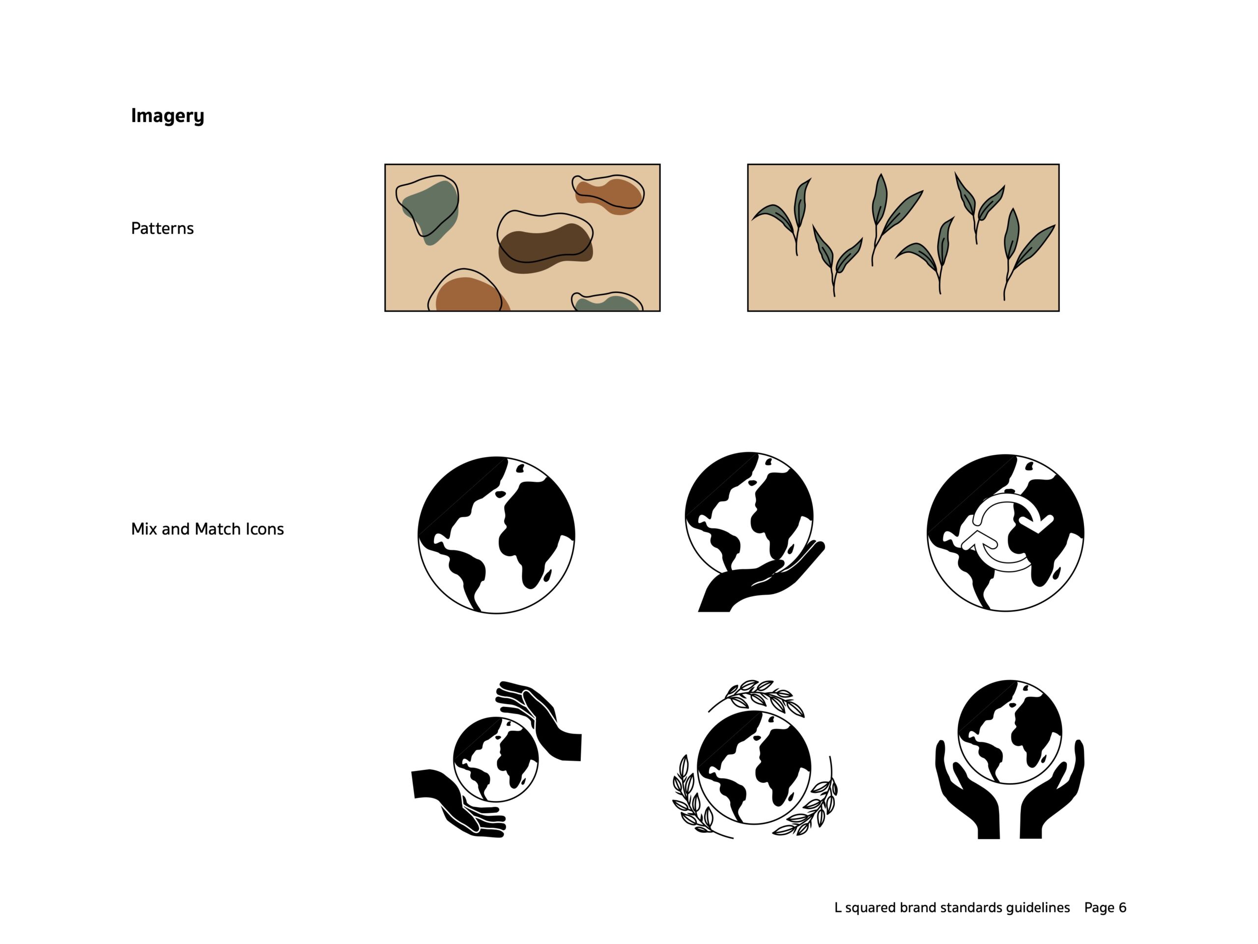
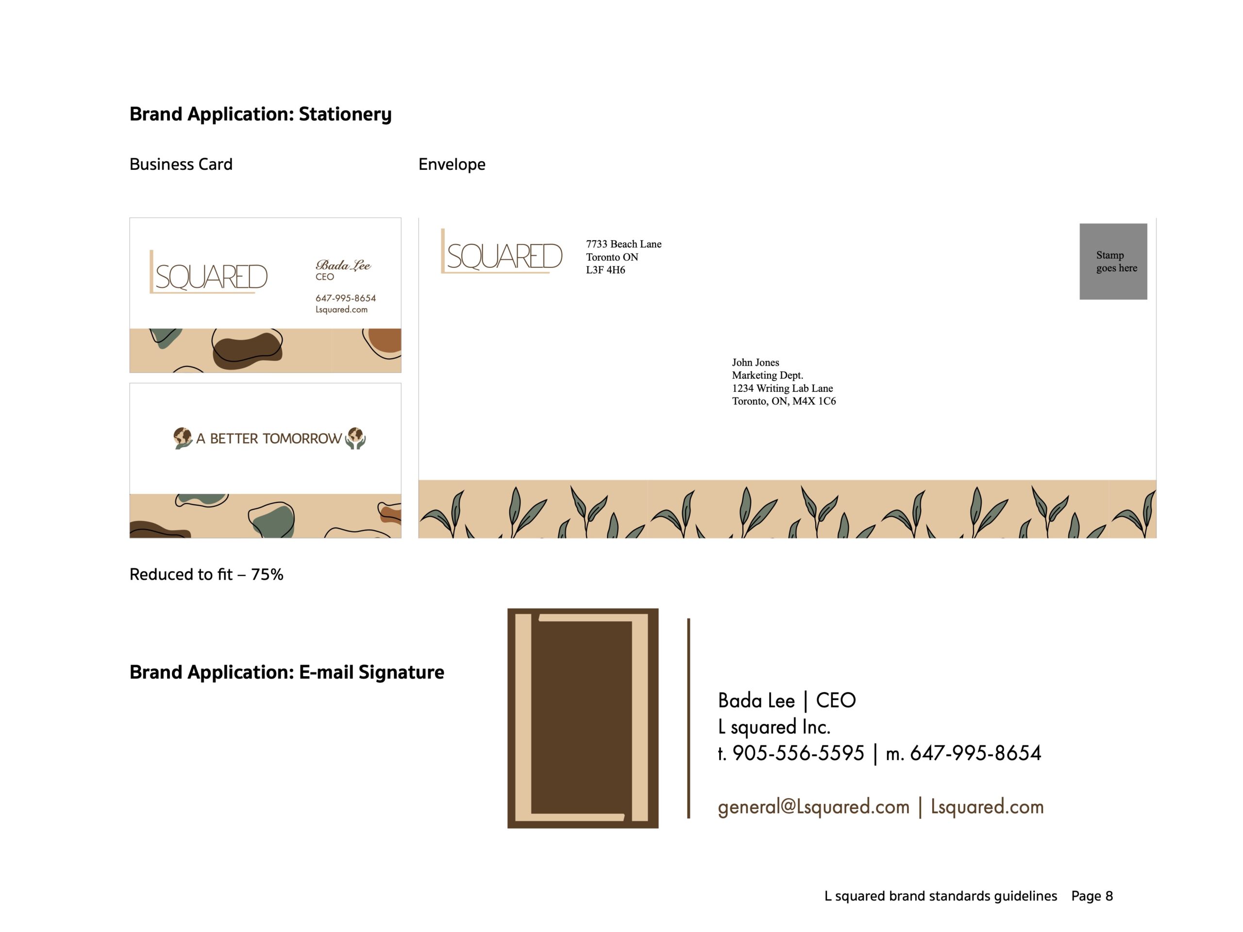
The main focus was on delivering a professional business document without excessive decoration. The introduction section provided insights into the client’s business, the purpose of the brand identity, and the brand book. It also outlined the marketing and communication strategies, emphasizing the brand personality, theme, and design style that resonated with the target audience. The store’s name and positioning statement/tagline were included with a brief rationale. 3 brand personality attributes were listed to represent the brand’s essence. The Brand Elements section covered various aspects, such as brand mark variations, brand mark spatial integrity guidelines, brand signature variations, two distinctive typefaces, a well-balanced colour palette, 2 original vector patterns, and 6 unique black & white vector icons. The Brand Stationery section featured letterheads, #10 envelopes, business cards, and an e-mail signature, all contributing to a cohesive brand representation. The final product showcased a well-crafted and consistent brand identity manual, adhering to professional standards throughout the creative process.
5. Brand Rollout
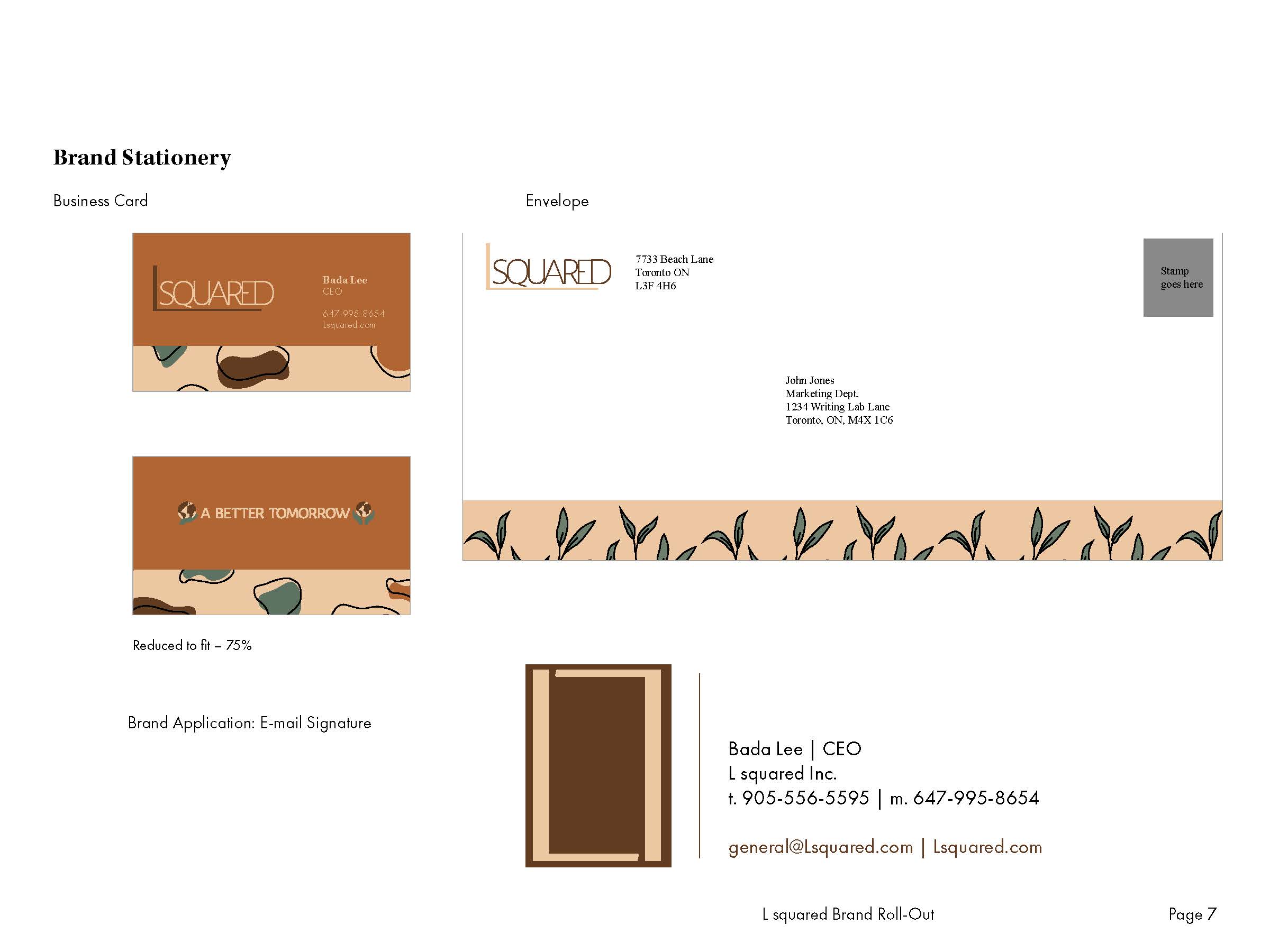
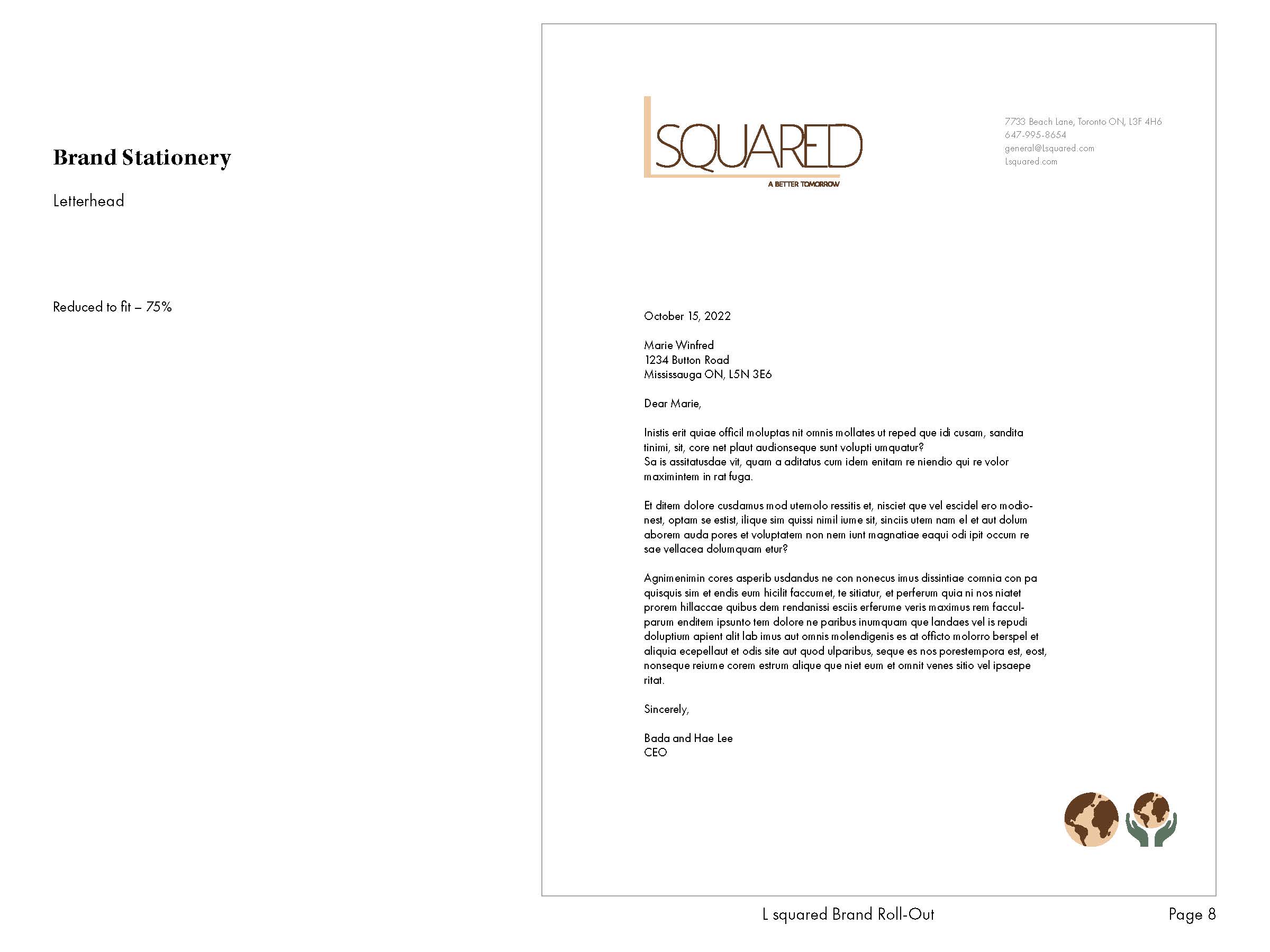
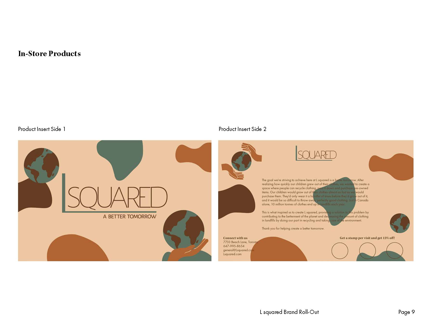
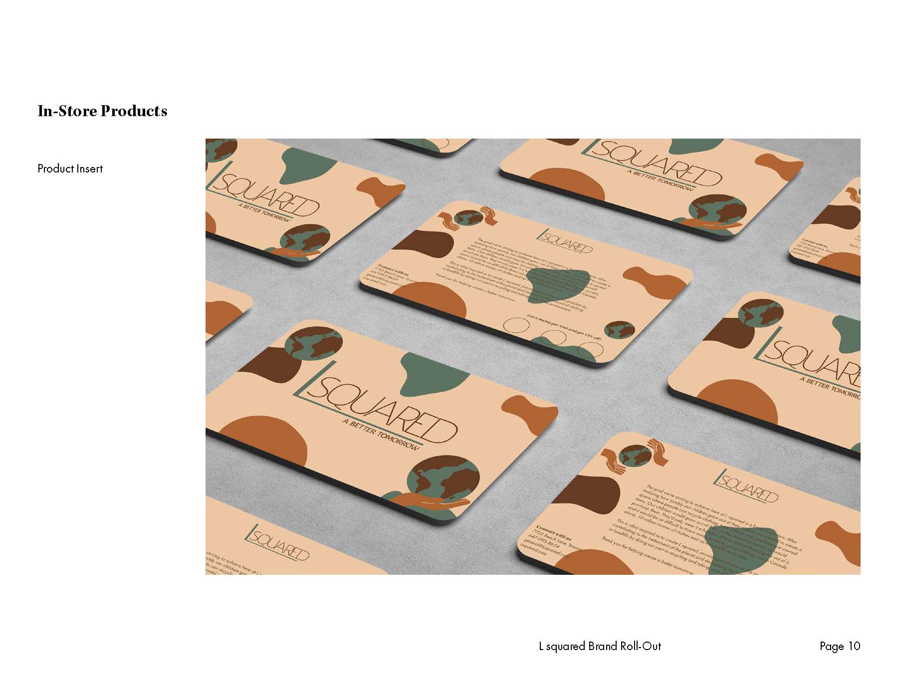
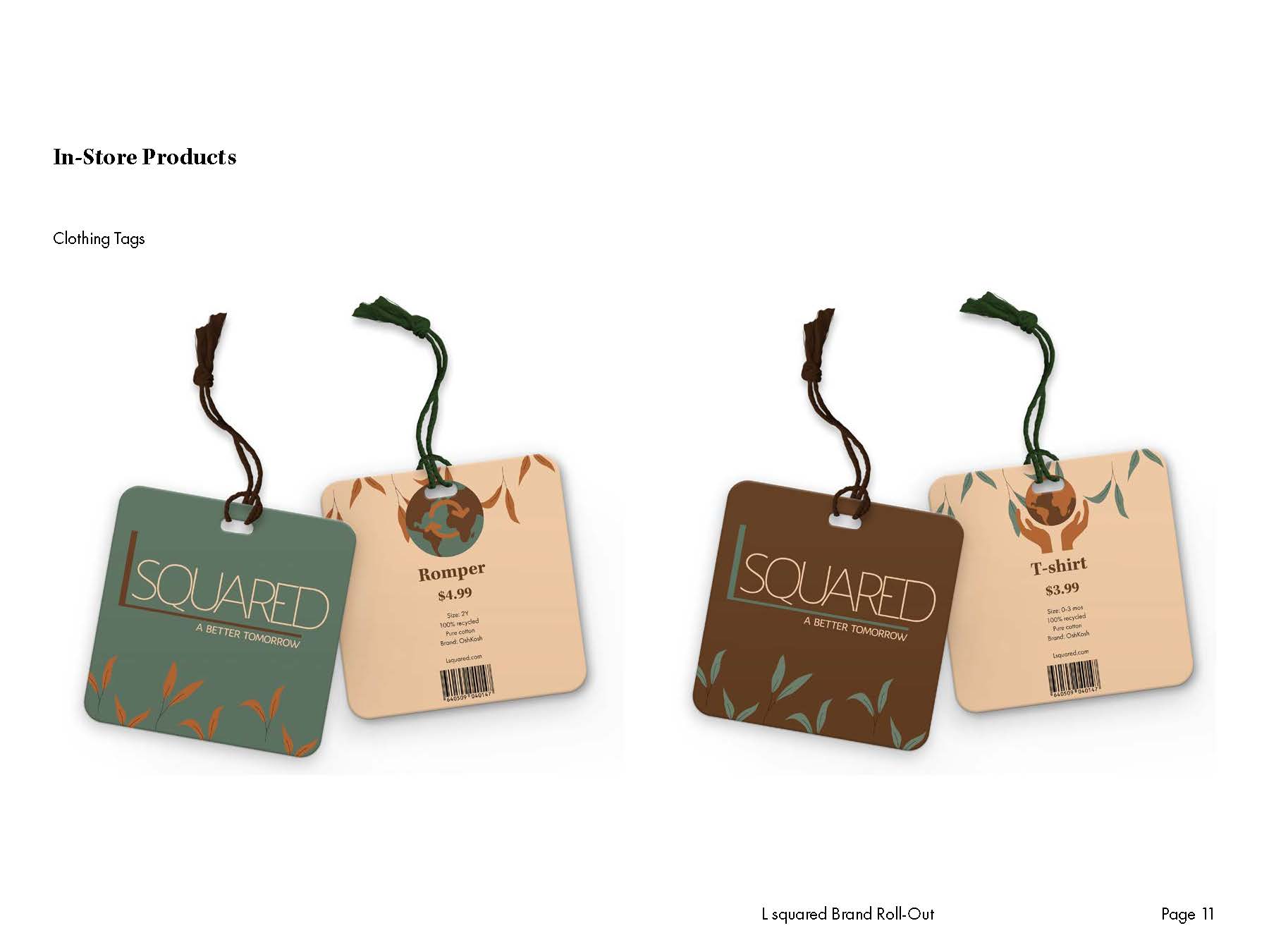
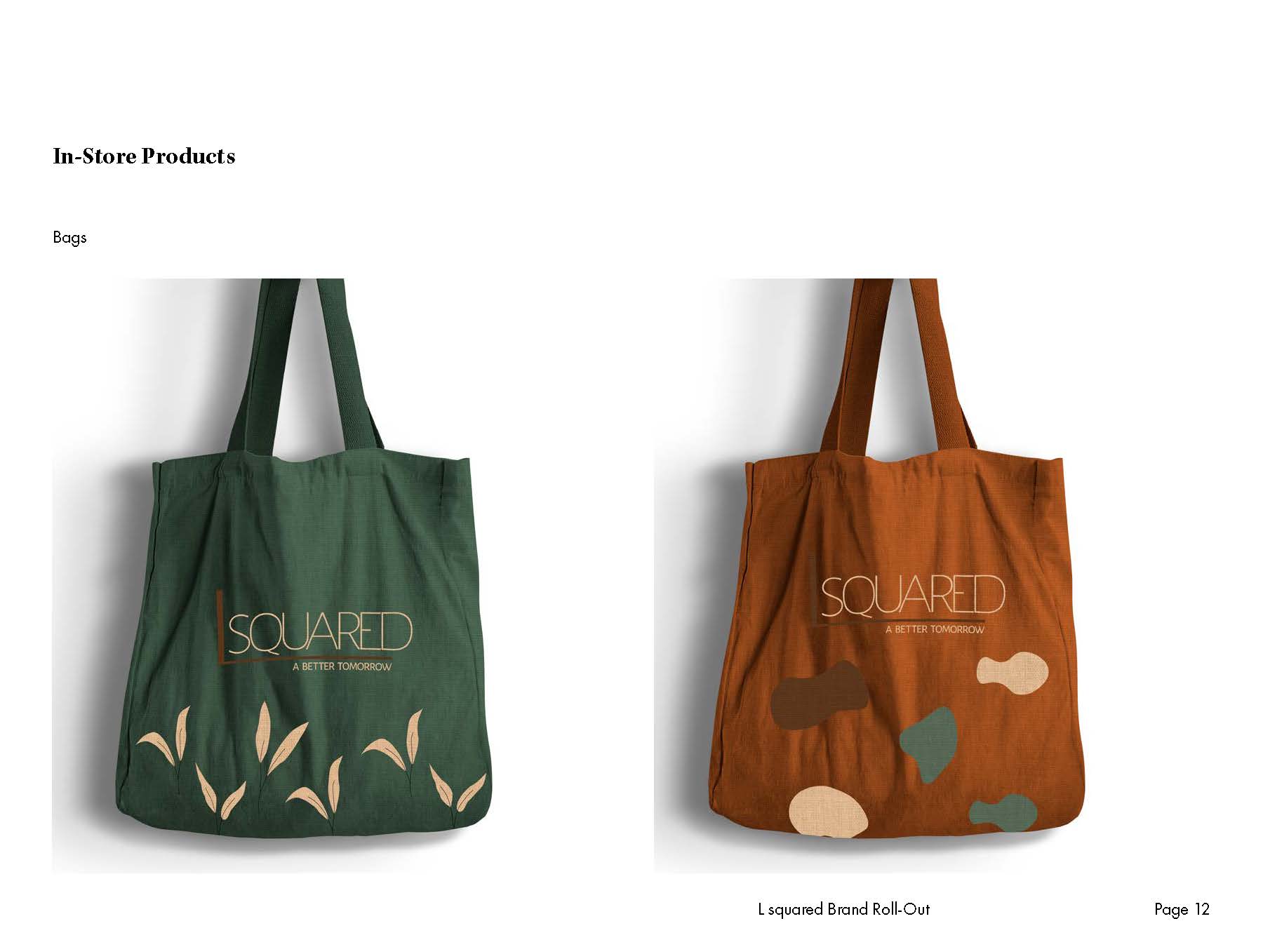
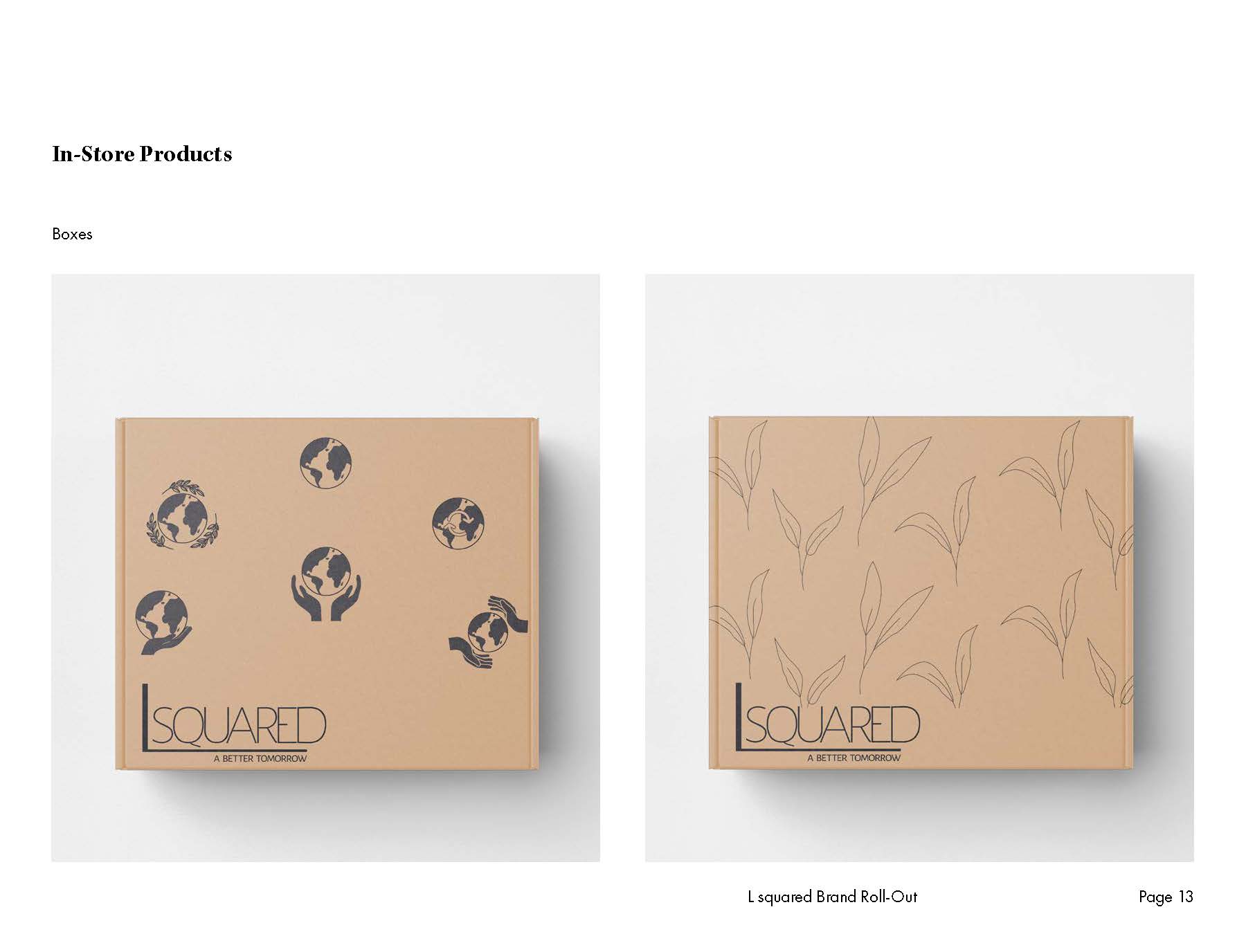
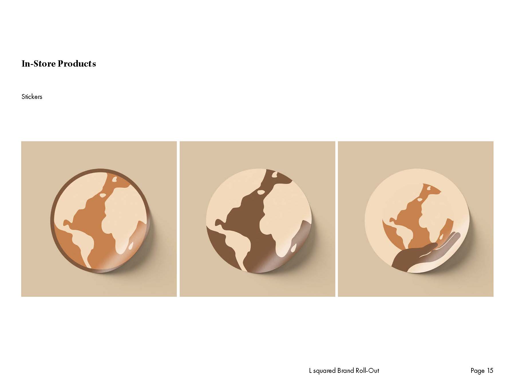
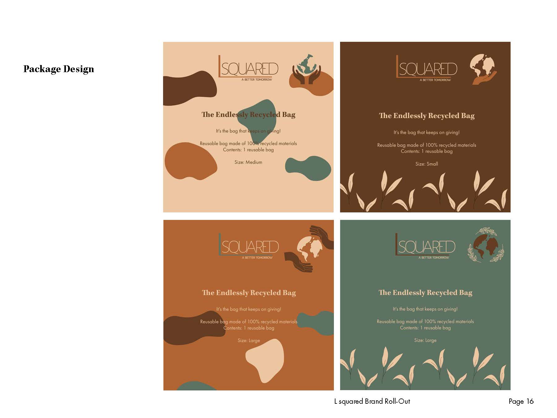
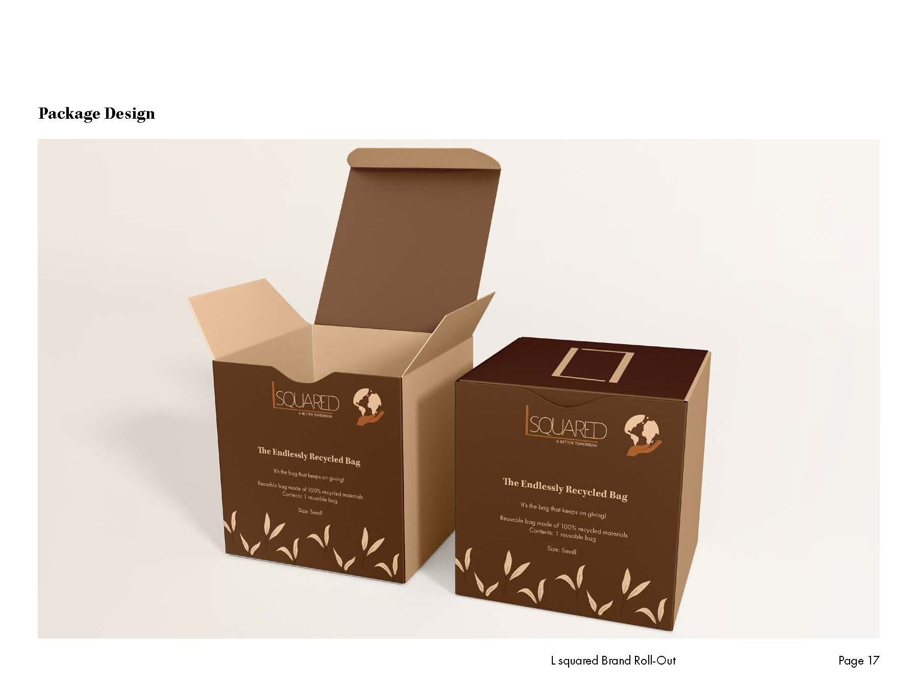
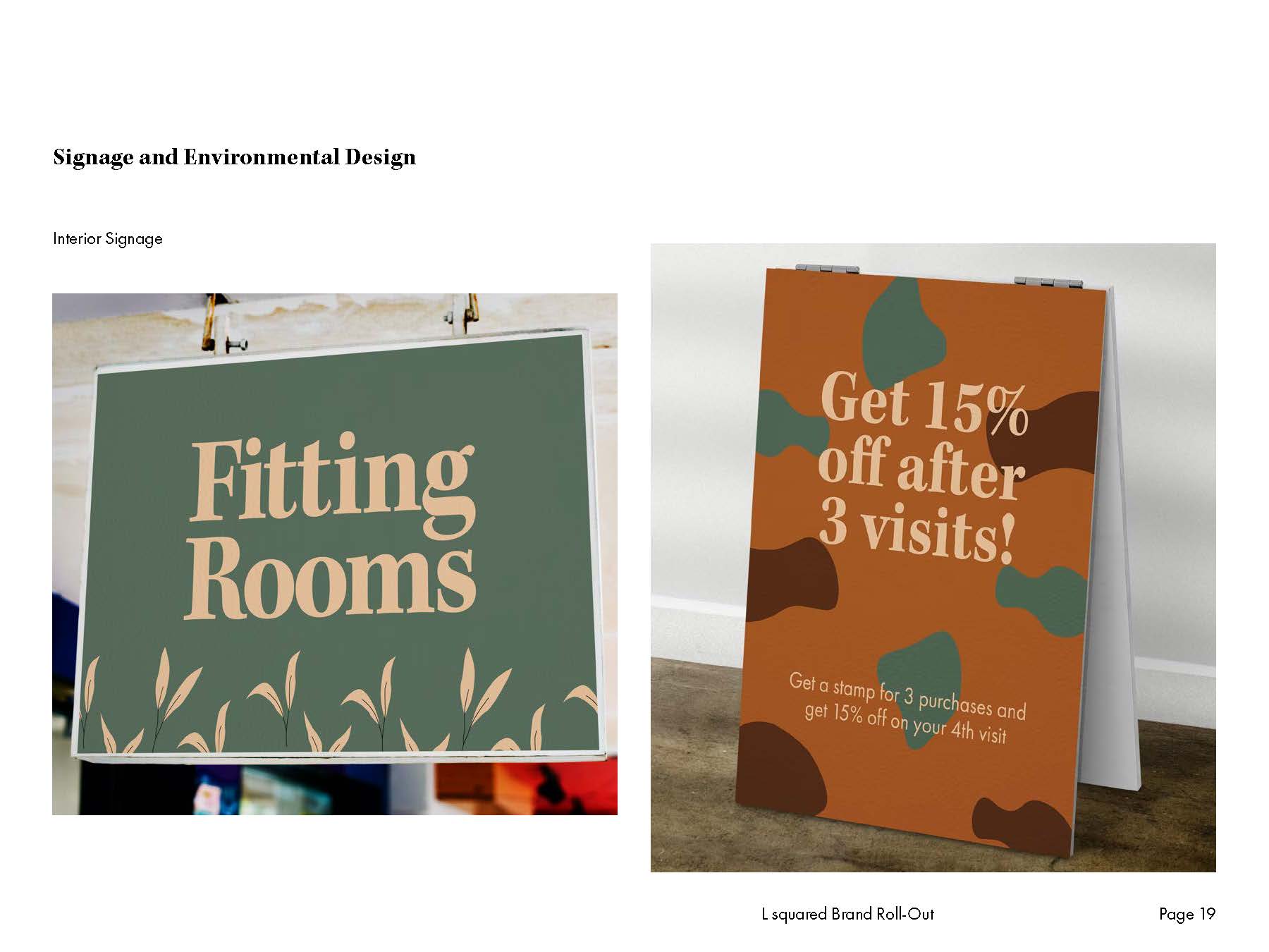
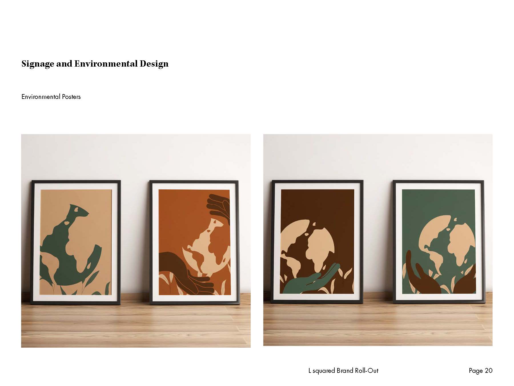
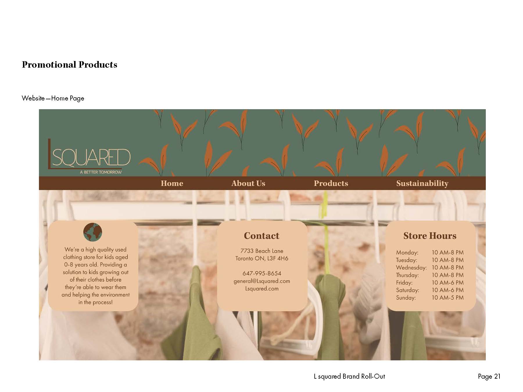
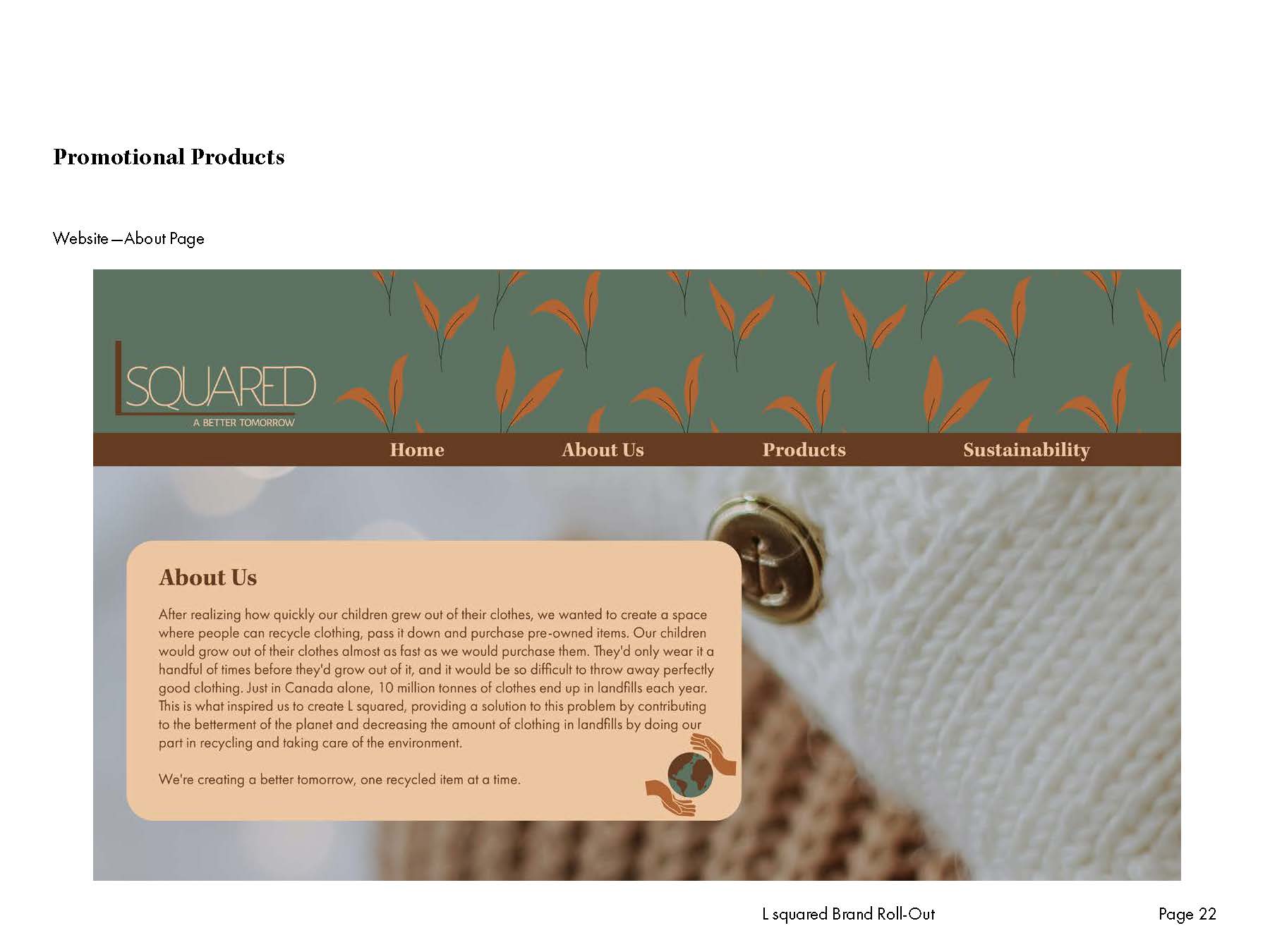
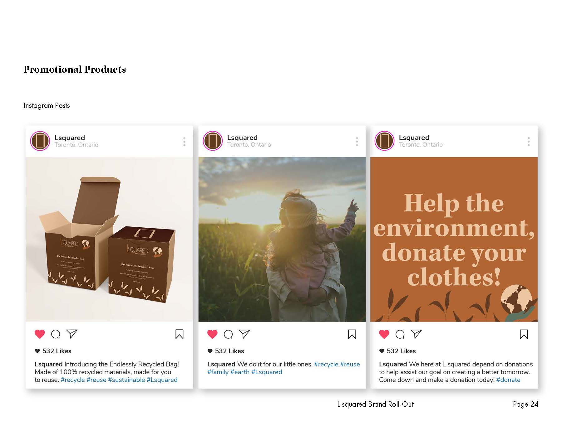
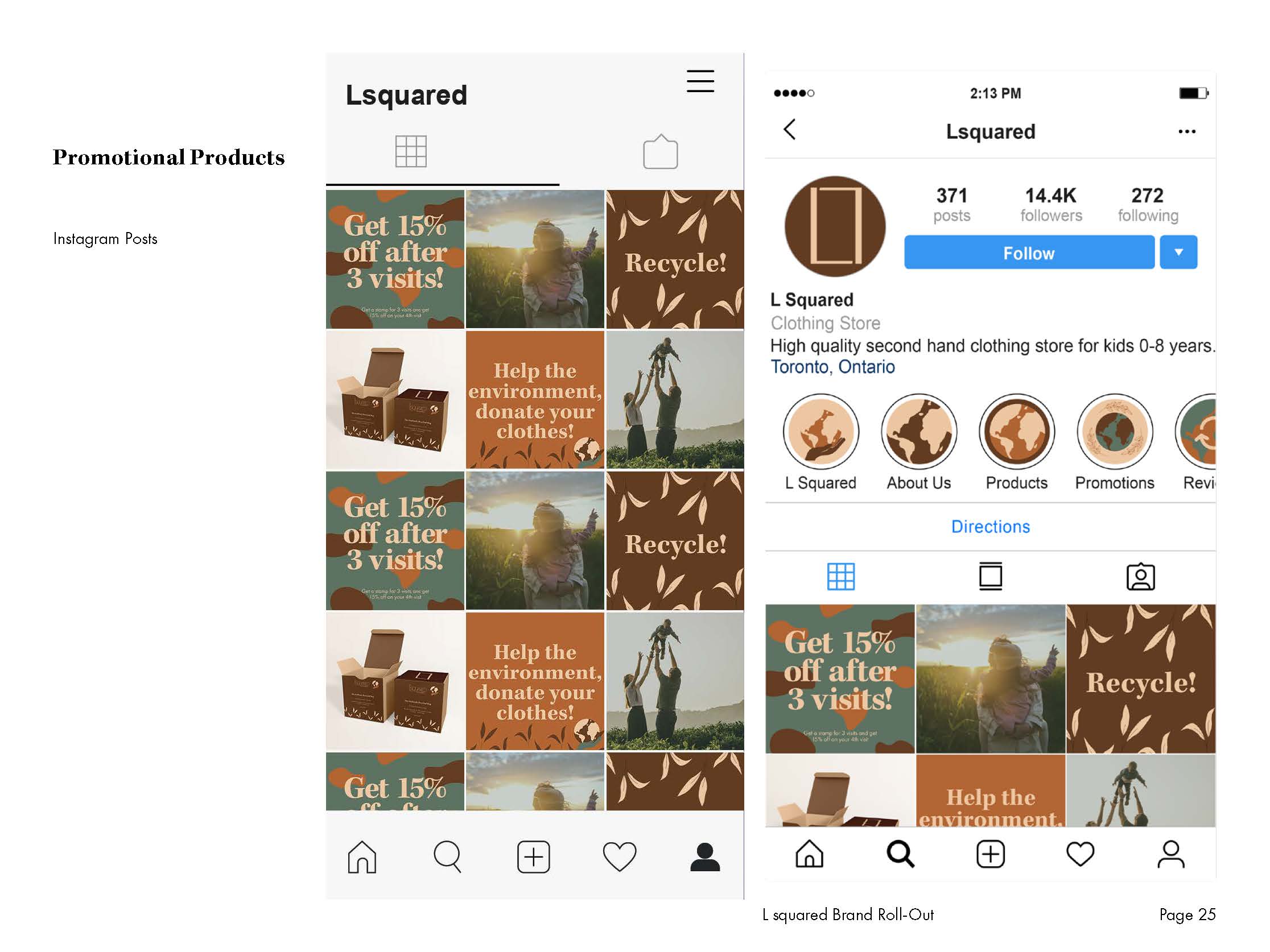
The rollout encompassed various elements, including brand mark variations, a carefully curated colour palette, two distinctive fonts, and custom icons and patterns. I designed brand stationery, including letterheads, envelopes, business cards, and an email signature, while also crafting engaging product inserts, clothing tags, bags, boxes, wrapping paper, and stickers. The package design involved creating labels for a line of four products, emphasizing consistent branding. I also tackled signage and environmental design, developing exterior building concepts with material and lighting descriptions, as well as interior signage and a series of impactful environmental posters. Finally, I contributed to the brand’s online presence by designing the Home Page and About Us page for their website, along with six cohesive Instagram posts and corresponding captions. All these elements were skillfully presented in a digital book format, showcasing the brand’s cohesive and appealing identity.